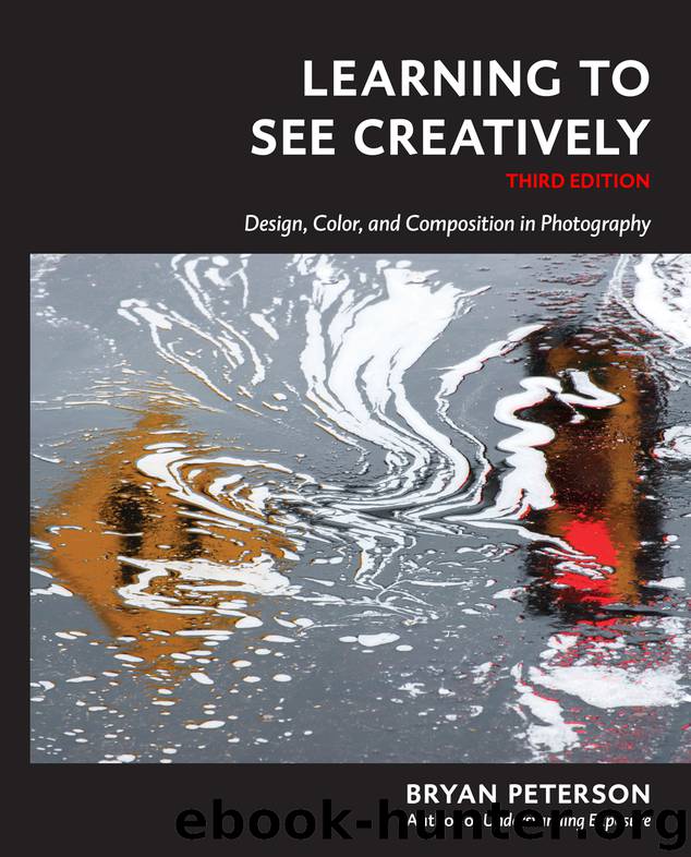
Learning to See Creatively by Bryan Peterson

Author:Bryan Peterson [Peterson, Bryan]
Language: eng
Format: epub
ISBN: 978-1-60774-828-1
Publisher: Potter/TenSpeed/Harmony
Published: 2015-07-07T04:00:00+00:00
This is neither the time nor the place to begin a debate on what constitutes art in photography, whether in color or black and white; however, this is the perfect opportunity to address the fact that color is indeed obvious. It is so obvious, in fact, that many photographers don’t see it at all! If people really saw color, they would be far too consumed by the need to shoot color if only for color’s sake.
To really see, and become an effective photographer of color, there’s much to learn. Color has many, many messages and meanings. You must become aware of color’s visual weight and the subsequent impact it has on line and shape, as well as its varied hues and tones.
Although the subject of color is deserving of its own book, if not a whole set of encyclopedias, I will limit my discussion to the primary (red, blue, and yellow) and secondary (orange, green, and violet) colors. Primary colors are called such because they cannot be created by mixing any other colors. The mixing of any two primary colors results in a secondary color: Mixing red with blue makes violet, mixing red with yellow makes orange, and mixing blue with yellow makes green. Color is often discussed in terms of temperature, with reds, yellows, and oranges (associated with the sun) often described as warm colors, and blues, violets, and greens (associated with water and shadows) often described as cool colors.
Red is known as a passionate and powerful color. It is the color of love and the “power tie” in the white-collar world. It is stimulating, exciting, and motivating. It is control, rage, and power. It is the color of blood, stop signs, and taillights. It is also the color that advances the most of all colors. What this means is, if you were to place red, orange, yellow, green, blue, and violet signs in a field all at equal distances from you, the red sign would appear closer than the others.
Of all the colors often placed with red, blue is one of the most popular, in large part due to blue being one of the colors that recedes the most. Blue is the infinite sky. It is a cool color, able to calm and nurture. It’s refreshing, soft, safe, and dependable. It is sensitive and peaceful. Blue sheets “feel” cooler on a hot summer day than do tan, apricot, or lemon-yellow sheets.
Yellow, on the other hand, is light. It is playful, creative, and warm. It can also represent cowardliness and illness. It is, like red, a color that advances.
Orange has the distinction of being the only color that shares its name with a fruit, and because of this, the color orange is associated with fruitfulness. It is fire and flames; it is warmth; it is the sun; it is lust, health, vigor, excitement, and adventure. Orange results from the blending of red and yellow; a perfect fifty/fifty blending results in a “perfect” orange. Orange, like red and yellow, is also a color that advances.
Download
This site does not store any files on its server. We only index and link to content provided by other sites. Please contact the content providers to delete copyright contents if any and email us, we'll remove relevant links or contents immediately.
Shoot Sexy by Ryan Armbrust(17741)
Portrait Mastery in Black & White: Learn the Signature Style of a Legendary Photographer by Tim Kelly(17020)
Adobe Camera Raw For Digital Photographers Only by Rob Sheppard(16990)
Photographically Speaking: A Deeper Look at Creating Stronger Images (Eva Spring's Library) by David duChemin(16696)
Bombshells: Glamour Girls of a Lifetime by Sullivan Steve(14086)
Art Nude Photography Explained: How to Photograph and Understand Great Art Nude Images by Simon Walden(13057)
Perfect Rhythm by Jae(5419)
Pillow Thoughts by Courtney Peppernell(4293)
The Book of Joy by Dalai Lama(3998)
Good by S. Walden(3568)
The Pixar Touch by David A. Price(3447)
A Dictionary of Sociology by Unknown(3092)
Fantastic Beasts: The Crimes of Grindelwald by J. K. Rowling(3067)
Stacked Decks by The Rotenberg Collection(2889)
Humans of New York by Brandon Stanton(2880)
Read This If You Want to Take Great Photographs by Carroll Henry(2719)
On Photography by Susan Sontag(2647)
Insomniac City by Bill Hayes(2565)
Photographic Guide to the Birds of Indonesia by Strange Morten;(2541)
